
Stand Gallery
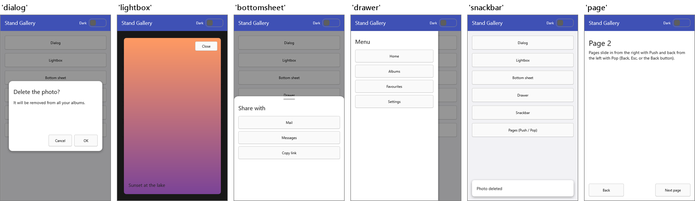
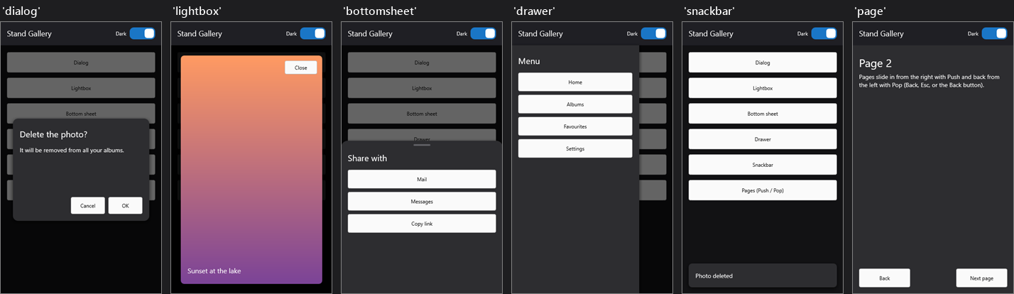
Six ready-made stands for the most common patterns of mobile and desktop apps, in a light and a dark version: load them in a style book and show your frames on them, without designing anything.
Since v.2.3
The stand gallery is available since v.2.3.
The stands
| Stand | What it is | Elements you may adjust (FindStyleResource) |
|---|---|---|
dialog | a card in the middle, over a dimmed background; fades in and rises | card (320 × 240) |
lightbox | the subject over a dark background, almost full screen; fades | container (24 px margins) |
bottomsheet | a sheet that slides up from the bottom, with a handle | sheet (height 360) |
drawer | a side menu that slides in from the left | panel (width 300) |
snackbar | a bar at the bottom; no background: the rest of the screen stays usable | bar (height 56) |
page | a full page that slides in from the right, and back from the left on Pop |
Every stand has a container element for the subject. dialog, lightbox, bottomsheet and drawer have a dimmed background named background_cancel: a Common Action on *_cancel makes it cancel the dialog, as in the demo.
Using the gallery
The stands are in two files with the same stand names: stands\Stands.Light.style and stands\Stands.Dark.style.
At design time: drop a TStyleBook on the form, double-click it, choose Load in the style designer, pick one of the two files, then assign the style book to StandBook.
At runtime: load the file, or a resource, in the style book of the component.
Stands.LoadFromFile('Stands.Light.style');
FrameStand1.StandBook := Stands;
The Gallery demo embeds both files as RCDATA resources (two RcItem entries in its .dproj) and loads one of them with a TResourceStream: this works on every platform, with no file to deploy.
Then show your frames on the stands by name:
procedure TMainForm.FormCreate(Sender: TObject);
begin
  // the Cancel buttons and the backgrounds of the stands cancel the dialogs
  FrameStand1.CommonActions.Add('*_cancel',
    procedure (AInfo: TSubjectInfo)
    begin
      AInfo.ModalResult := mrCancel;
    end);
end;

procedure TMainForm.ShareButtonClick(Sender: TObject);
var
  LInfo: TFrameInfo<TChoiceFrame>;
begin
  LInfo := FrameStand1.New<TChoiceFrame>(nil, 'bottomsheet');
  LInfo.Frame.Choices := ['Mail', 'Messages', 'Copy link'];
  LInfo.ShowModal(
    procedure (AFrame: TChoiceFrame; AResult: TModalResult)
    begin
      if AResult = mrOk then
        Share(AFrame.Chosen);
    end);
end;
A snackbar goes away by itself with HideAndCloseAfter, which does nothing if the snackbar was closed before:
LInfo := FrameStand1.New<TToastFrame>(nil, 'snackbar');
LInfo.Frame.Text := 'Photo deleted';
LInfo.Show;
LInfo.HideAndCloseAfter(2500);
Pages go with the navigation stack: FrameStand1.Push<TDetailFrame>(nil, 'page'). The page stand slides forward on Push and back on Pop by itself.
Light and dark
The two files have the same stand names: to switch theme, load the other file in the same style book. Subjects already on screen keep their stand; the next ones use the new one.
The stands give the surfaces (card, sheet, panel, bar, page) and the background; the frames keep the colors of the style of the application. With a light application style on dark stands, set the font color of the labels of the frames, as the demo does in OnBeforeShow, or use a dark application style.
Changing the stands
The gallery is a starting point: copy a stand in your own style book and change it, or resize its elements in OnBeforeShow:
procedure TMainForm.FrameStand1BeforeShow(const ASender: TSubjectStand;
  const ASubjectInfo: TSubjectInfo);
begin
  if ASubjectInfo.StandStyleName = 'dialog' then
    (ASubjectInfo.Stand.FindStyleResource('card') as TControl).Height := 180;
end;
The sliding stands move by the size of the stand or of their own element, whatever the size of the form, thanks to animation values from the stand size.
The Gallery demo shows all the stands, light and dark, with dialogs that return a result, a snackbar and pages.